Overview
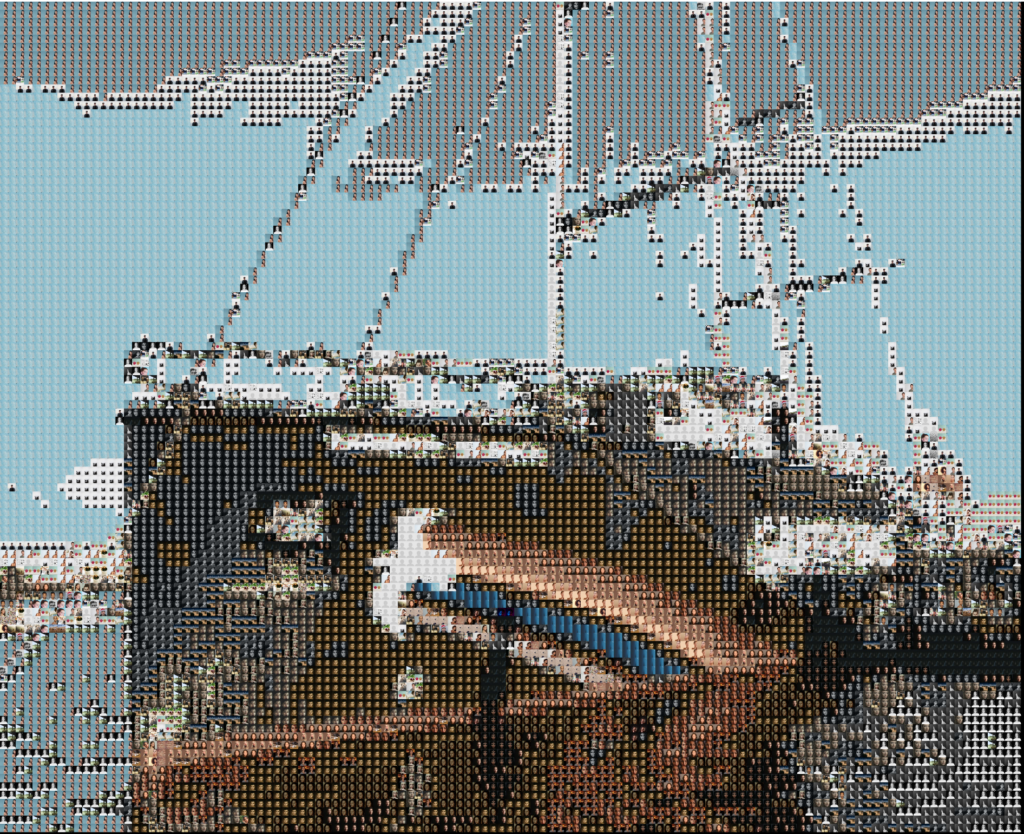
Greenpeace turned 50 in September 2021 and wanted to give their supporters the recognition they deserve. They wanted to create a “photo mosaic” – a large image composed of smaller images in which supporters could contribute messages and photos to. The brief was that at least 7,000 supporters should be able to contribute, that the tool needed to be embedded on their website, and that it needed to be ready in just under two months.
Outcome
Supporters contributed nearly 20,000 messages and nearly 9,000 of their own images to the wall – far surpassing initial expectations. Feedback from users, supporters and staff was very positive and we’re now exploring ways to make the technology part of more campaigns and an ongoing offering for supporters. Building and displaying the mosaic walls – each of which ended up containing fifty gigapixels (50,000,000,000 pixels) was challenging (in a good way) and the site launched on time and performed well even under heavier than expected user numbers.
We all really enjoyed working on the project and the people at Greenpeace said they enjoyed it too. One of – possibly the main – thing that made the process work and meant we ended up with something everyone could be really proud of is that everyone took ownership of the project and worked on it as collaborators – no one was telling anyone else what to do: we were just all using our skills and expertise as best as we could to reach our common goal. It felt great and we are very, very thankful to the Greenpeace team for their part in that – we recognise it takes great trust as a client to take that step back.

Our approach
As with all our technically challenging projects, we started by clarifying the desired impact of the project and then carried out and in-depth investigation of the technical challenges before settling on an approach for the build.
As time and budget were limited, and because the Greenpeace team already had a clear and sensible product idea we kept initial concept exploration fairly narrow (e.g. we didn’t try to reinvent the wheel or sell them a camel when they wanted a car). We ran a theory of change session for the project with the Outlandish team and the main Greenpeace stakeholders – the fabulous Tom Micklewright and Deborah McLean.
We ended up with a project goal of “Create a tool/experience that builds loyalty with Greenpeace’s supporters by celebrating their achievements over the last 50 years putting their personal messages and experiences front and centre of the future discussion of climate crisis”. It was really useful to clarify the balance of celebrating the past 50 years with the “future discussion of climate crisis” and made a lot of the design decisions later much simpler

Initial technical investigation
With any technical area you don’t do day-in, day-out it’s important to start by investigating the parameters of the project. I tend to think of it as “how many of what things do we have and what do we need to do with them”.
We started by looking at some existing photo-mosaic tools including commercial services such as https://mosaically.com/ as well as open-source or publically available code such as this python photo mosaic generator by uvipen, this PHP version by eflorit, and this one which uses machine-learning techniques.
Trying out these different version with different sets of images and parameters taught us a lot:
- The big image needs to be made of a lot of smaller images unless it’s something really simple. 30,000-50,000 images looked about right. This is a lot more than you’d need if you had “perfect” images but in reality the small images are far from perfect
- People’s faces tend not to be green, blue or red so you need to do some sort of colour tinting if you’re going to make an image out of user-submitted portraits (unless you want to render a main image that’s predominantly skin tones)
- Some of the processing can be very time consuming and computationally intensive
- Things get harder if you want to use each image once, or the same number of times
- Small changes in parameters can have big impacts on output and processing time
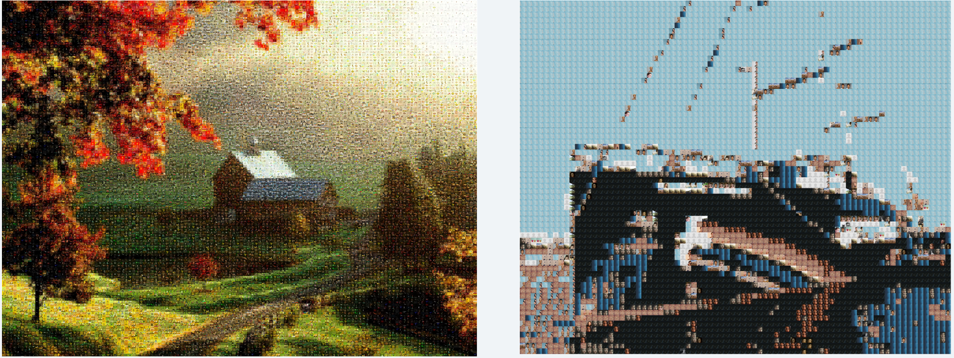
Some approaches worked better than others:
Rainbow warrior made up just of a few hundred faces didn’t look right:

In the end we identified some key issues that none of the libraries we found overcame:
- Use each image once (or the same number of times) – we didn’t want to find that one supporter had been used 1,000 times while another was used 1 (or zero!) times
- We needed colour tinting because we couldn’t rely on our library of submitted images having a good colour match for the target image
- The final image needs to be very big – if people want to be able to see the image they uploaded clearly then they need to be quite large (at least 500px x 500px)
- The process needed to be quite efficient – we don’t want to contribute too much to environmental degradation by running a server farm all night to generate a picture that’s about preventing the climate crisis, even if that was financially viable for the project
All these turned out to be quite complicated problems to crack!

Technical solutions
Colour matching
If your target image is made of 50,000 pixels/tiles and that you need to find the best candidate from your user-supplied image library for each tile it’s quite complicated to do the matching.
First you need to know the difference in colour between each “tile” from the original image and each candidate. That’s 50,000 x 50,000 – or 2.5 billion – differences to calculate which is quite a lot and even with a modern computer you need to make sure you do each comparison in a very efficient way or you’ll have a problem. If calculating each difference took one second it would take just under 80 years to calculate them all. To make maters worse, if you wanted to find which of the combinations of those differences is best you have another ‘NP-complete’ combinatorial optimization problem on your hand – there’s something like 6,250,000,000,000,000,000 combinations to assess for 50,000 tiles.
In the end we:
- calculated the average RGB value for each of the candidates and “tiles”
- converted those to LAB colours (an alternative ‘colour space’ where it’s easier to calculate the perceptual difference between two colours)
- used the very fast C implementation of the `delta_e_cie_2000` algorithm from the excellent pg_colors postgres extension to do the comparison
- used lots of workers (as many as we had cores on the machine) to process the tile matching (and made sure we got the row locking in the database right so we didn’t assign the same tile/candidate twice accidentally)
- didn’t bother trying to find the best combination of assignments – life too short, literally in this case
Colour tinting
Because the colour of the submitted images was not a perfect (or even vaguely close) match to the image we wanted to create we needed to do some sort of colour tinting. Commercial service Mosaically essentially overlays a transparent image of the target main image over the grid of submitted images. This is quite effective but seems like a bit of a cheat. We tried various systems of colour shifting, highlighting and tinting and, in the end, we:
- Calculated the average RGB value of each tile and candidate
- Converted the averaged colours to the Hue Saturation Value (HSV) colour space
- Replaced the hue of every pixel in the submitted candidate image with the hue of the assigned target tile
- Averaged the saturation and value of each pixel from the candidate image with the saturation/value of the average colour from the target tile
- Did all of the above using numpy and compiled, vectorised C functions which are orders of magnitude faster than trying to do the same thing with loops in a language like PHP or Python
Very Large Image
If you want to make a big image out of 50,000 images, and each of those images needs to be 1000 pixels square you are trying to generate an image with 50,000,000,000 pixels. This is over 4,000 times more pixels than a full resolution image from an iPhone 12 Pro, and nearly 12 times the size of the maximum possible jpg image (which only supports 65,535 pixels square). Even if you could put an image this large on the web, no one would be able to see it because it would be several gigabytes of data, and no browser would be able to render it.
To get round this we:
- Split the giant image into lots of tiny images that could be sent over the internet, and generated these “tiles” at lots of different resolutions so that you could view any “screen” of the images and still only download a few kilobytes of data. This is how most high-resolution photography is displayed and how systems like Google Maps and Open StreetMap often work
- Used OpenSeadragon as a viewer of these tiles – we could have used something like leaflet which is a bit more modern and which we use for other projects, but which doesn’t have the nice smooth zoom effect that makes OpenSeadragon so good.
- Used the excellent LibVips library and PyVips wrapper which is great for fast, low memory-usage image manipulation – kudos to John Cupitt for being the most responsive maintainer I’ve ever come across and clarifying that yes, it was normal to need hundreds of gigabytes of RAM to do this kind of thing, even when done well.
- Used a big server to generate the images, but only when we needed it. Even with the various optimisations we’d put in place there was no getting around the fact that there is a lot of processing to do. We ended up using computers with 72-96 cores and 144-768 Gb memory, which still took 1-2 hours to run the end-to-end process. The process could be streamlined a lot further but this was an acceptable timeframe and use of processing power.
Next steps
The whole team really loved this project. It was stressful at times but we’re really looking forward to doing more things like it. We’re talking to Greenpeace about how they can use this and similar tools in other campaigns and we’re all buzzing with ideas about how to make fractal image galleries that no one can tear themselves away from.
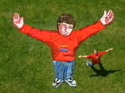
I personally want to make search engine that displays a whole organisation as if someone had taken all their documents and people and laid them out on a giant field, like a mega Art Attack-come-mind-map/rostrum camera of god. I probably need to do a bit more thinking about how to explain that one, let alone build it.
Do you want your search engine to look like a giant art-attack-meets-the-rostrum-camera-of-god? If so, get in touch. Or if you have a more sensible idea feel free to email hello@outlandish.com.


