

The challenge
These days, hardly anybody needs persuading that the emissions we produce are a serious issue for the environment. But, depending on where you live, it’s easy to forget that this isn’t only on a global and long-term scale; it’s on a local, much more immediate scale too. The quality of the air we breathe has a direct effect on health outcomes—in fact, air quality is the largest environmental risk to public health in the UK.

We know that individuals and businesses’ behaviours, and the choices they make in how and when they use the roads, are a large part of what causes poor air quality in cities. But this, of course, means that their behaviours can be part of the solution too.
This is where Cross River Partnership come in. They deliver a range of environmental, economic and community-based projects, encouraging Londoners to make small changes that will support everyone who lives and works in the area. Their goal: to produce a simple tool that they could use in supporting local businesses to adapt and improve. It should enable people not just to find out the emissions from their road use, but to see easily how they might be reduced.
Our approach

The tool’s knowledge comes from the Emissions Factors Toolkit, published by the Department for Environment, Food and Rural Affairs. The first step was to turn these pages of factors, descriptions and lookup tables into a system that could lie underneath a modern web app. For this project we collaborated with the air quality experts at our friends Tranquil City. They produced an impressive spreadsheet version that served two vital purposes: firstly, giving Cross River Partnership a detailed and much improved tool to use in their own research and consultancy; and secondly, giving us a clear model of the data and methods to use for our calculations.
After that, we settled on a few key decisions to guide the product development:
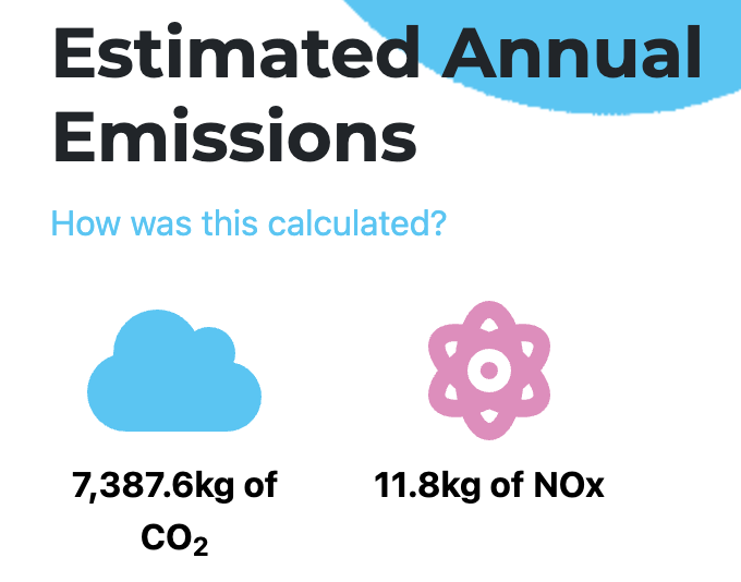
It needed a visual design that was straightforward, appealing and friendly. This is particularly important when you’re trying to encourage the public to engage with concepts like ‘ten-micrometre particulate matter’. Every little helps.
The calculations needed to update in real time, whenever a user added or changed anything. There should be, in other words, no ‘submit’ button. This would make the tool more enjoyable to play with and, most importantly, drive home the direct causal connection between each individual decision and its results.

There should be a range of suggestions and “nudges” displayed, swapped in and out to be always relevant to whatever data was onscreen. Some of them are straightforward always-true facts like “nearly half of NO2 emissions in London come from road transport, with the highest concentrations of NO2 at congested roads.” Others are dynamic conditional messages like “If these X buses were electric, total NOx emissions in this area would be at Y per cent of these levels,” only displayed if a certain number of buses were included in the calculation.
The tech
We built Transport Emissions London using the Nuxt framework, using Nuxt’s ability to build and deploy the project as static HTML, CSS and JavaScript. This keeps it lightweight and fast to load, and means there is no backend to worry about at all; no database or anything like that. This, in turn, means there are no user accounts, passwords or logins to manage.
But part of the goal for this tool was to encourage people to get in touch to find out more, and perhaps work with Cross River Partnership on developing more detailed plans to become more sustainable. We achieved this with a deceptively simple solution: an embedded Google Form that pops up when a button is clicked. All responses are saved directly in a spreadsheet in Cross River Partnership’s Google account, and they’re emailed each time another one comes in.
Well, I never knew that
You learn a lot of intriguing facts making a product like this. Did you know, for example:
- that electric vehicles still emit pollution? This is ‘particulate matter’—the tiny particles that fly off into the air, for example, when brake pads rub on wheels or when tyres move on roads. You would then think the same would be true of bicycles, and technically it is—but at such negligibly small levels that bikes are treated as zero emission. The lesson: all ‘green’ options are not equal.
- that local air quality and global climate change are quite different issues, and if you’re focused on one you might make different choices from if you’re focused on the other? The lesson: don’t fall into the trap of thinking “environment” is one single category, or that “emissions” and “carbon dioxide” are interchangeable.
- or that the time of day you travel makes a difference to your emissions? At peak times, you’re more likely to move slower, so your engine will be on for longer. Plus you’ll start and stop more often, applying the brakes each time, which brings us back to those particulates.
Facts like this are why it’s so valuable to have reliable, trustworthy and easy-to-use tools like Transport Emissions London. None of it is that difficult, but it’s not always intuitive—and with a quick, interactive web app, there’s a chance to really educate people; to help them develop that intuitive feel for the issues. That’s how we might make a long-term difference.
What’s next?
Transport Emissions London is up, running and well received. When it’s been going for a while, we hope to look at the impact it’s having—seeing how many people get in touch with Cross River Partnership through it, and perhaps doing some user testing to look at how we might optimise it.
The great thing about a tool like this is that we can directly map its effect on the surrounding environment. Because every decision that someone makes after using it—to consolidate into fewer deliveries, to travel off-peak, to switch to a different vehicle type, or whatever else—translates immediately into a quantifiable improvement in the air around them.
Have a look, and see what you might change.


![Featured image for [REC] for good: video technology in Greenpeace’s ocean protection tool](https://d36p1eyfnw1szn.cloudfront.net/web/uploads/2022/08/Screenshot-2022-08-17-at-14.00.55-290x218.png)

