

The Brief
Initially we scheduled a design thinking session in the form of our Design Sprint in a Day to bring together Greenpeace’s clever campaigning minds with our clever design and innovation minds.
If you know Greenpeace, you know that they work on lots of great things at any given time and naturally this can bring up challenges – how to create digital tools that keep their supporters engaged and influence long lasting change? How to create something that is quick turnaround (sometimes incredibly quick!) And still works? We framed it as a session to work through some ideas and talk about how/if they’d be technically viable – we really like these open exploratory sessions and find that we’re a good sounding board to guide or shape a project.
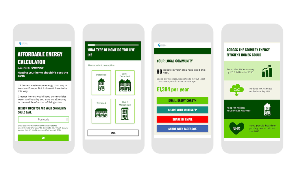
Closer to the day, the Greenpeace team had already been exploring a tool that could show an estimate of what savings people could make if the Government implemented a genuinely good energy efficiency policy, with a tangible comparison of what bills are likely to be like with and without one. They had already worked with Cambridge Econometrics to build an Excel tool to assess the medium-term impacts of energy efficiency measures and zero-carbon heating technologies on energy bills faced by an individual household. Now they needed a working front-end to send to supporters so that they could understand the pros of a good energy policy, and the cons of a bad [read: current] one.
The Client
We all know how hard it can to keep up with policies – the amount of spin that goes into them sometimes appears to be more than creating the policy itself. As voters and laypeople, how are we to know what we can trust and what has been shrouded in the mystery of big numbers and clever-sounding technical terms that don’t really mean anything?
Greenpeace wanted the tool to inform the debate on the need to accelerate the transition towards clean
heating technologies and improved energy efficiency, and demonstrate the related benefits for different households, especially in the current economic and political context. If there’s one thing that can unite a user, it’s seeing the cold hard cash savings they can make, so that what we decided to show them.
Our Solution
During our initial session we dived into the numbers with Cambridge Econometrics to make sure we fully understood their workings. Our entire team was present – producer, developer and designer, to make sure that we each understood how we going to make the project a success. We were joined by Greenpeace’s product owner, project manager and CE’s team that produced the Excel tool.
Greenpeace needed to leave the day with a wireframe of the tool. This is a fundamental part of any digital tool – if you can’t draw the key screens, how are you going to start, and how do you know if you’re making jumps in logic?

We split into three groups to explore the key areas of the tool: Questions to ask the user – not too many, but enough to capture the data that we need and show them reliable results. You might be surprised at the amount of people that don’t finish surveys and leave after reading the first question; reporting that was easily digestible and showed the gravity of what a good policy would mean for them; how to take action and put pressure on the Government. We finished the day with wireframes of the three areas, and watched the Japan v Croatia World Cup game to decompress.
After the session, we refined the user journey and quickly got into designing each screen alongside investigating the tech that would best support the tool, segue alert!
The Tech
After an initial investigation, Ben decided to go for Laravel Livewire because it was great for fast prototyping and making a really responsive form with some custom logic and calculations built into it. That’s exactly what we needed, so we went with it.
Statistics
Over 10,000 people used it on launch day, and the tool worked beautifully with no downtime or delay.
And of those people, 95% who started the form completed all of the questions.
30% of people emailed their MP. This is a great conversion rate based on us asking users to stay with us and complete a final step.


