I was introduced to OOUX, object oriented UX, at ConveyUX, a three-day conference about User Experience Design in the north-western tech powerhouse, Seattle. I took the most from the interactive workshops on the first day, I have always been a fan of doing the thing over just listening. This post breaks down why I found Sophia Voychehovski’s workshop on object orientated UX particularly useful as a take away. Sophia has also written a really good article about OOUX on a list apart which you should definitely check out.
I am seeing OOUX, as a method or a process which enables you to move more efficiently from business & user goals into a utilitarian type of prototype. The opportunity to create and test a valid and agile prototype earlier on in the life cycle of a digital product is something we have been experimenting with at Outlandish. We are always looking for effective ways to add value to our ideas. I think that OOUX has the potential to speed up the sense making stage right at the beginning. This theme of early prototyping continues on from my last post about getting to a test from an idea in 3 hours. In this post I take the idea of prototype a step further, I will show you how to use Axure to elevate design thinking.
We currently start the UX process at Outlandish by working with our clients to create user stories. These stories define what gets built and means that we all stay on the same page throughout the project. It is as much a business decision as it is a UX decision. What if a prototype could be used to take this sense making step further, we all know that clients understand something quicker when it demonstrates its purpose better. OOUX should help get that prototype on the table in time for it to be effective.
Before launching the process on our dear Outlanders I decided to try out on a mobile app I have been working on in my spare time. I discovered that OOUX excels in a few areas when just looking at it from a design perspective. It gets you thinking the right way about what should be included in the application and why, aligning well with the minimal viable product methodology. However, it also lets you plan and be really innovative about how all the things all link up together. All the thinking is done with sticky notes which means that changing something is really low stake. Basically it made all the UX stuff easier and helped me think more clearly about what should be in my app conceptually without getting lost in decisions that didn’t need to be thought about yet. Such as; page layout, what the interactions should be, or even what should be in the persistent navigation. As well as this it revealed gaps in my knowledge about user behaviours and helped me frame the questions I needed to answer by doing further user research.
The OOUX process starts once the initial research stage is over and user goals have been nailed down. I will demonstrate using the user goals from my climbing app project, now dubbed Craggle.
Extract Objects from Business/User Goals
This stage requires you to choose what the objects are, you need to extract the correct words from your business/user goals, i.e. the nouns that define your product. These are your objects.

Here I have
Climbers
Climbing place
Climbing type
User climbing abilities
(Account)
(Climbing day)
(Living location)
I discounted climbing day and living location as objects as I want 5 objects or less for an MVP, I will explain how these concepts can be included in a lean way later on in this post. I have also discounted account as an object, but I may put this back in later. I will have a clearer idea about what this needs to contain after working out the climber object.
I wasn’t sure if it was necessary to have user climbing abilities as an object in its own right, it could lie under account in some way or even under climbing type. However I don’t have account as an object for now so I think this needs to be an object. Testing will let me know if this makes sense or not.
As well as this I can see that the suitability of climber and place will be important in how theses objects are listed and found.
At this stage I do not need to think too deeply about what the homepage will consist of. It is important to have a good landing page as it introduces the objects, the app’s content, to the first time user. How the homepage manifests these objects can be thought about last and even after the initial prototype test. On a side note, with social media and search tools the home page is not necessarily always the landing page for a first time user anymore (more typically in web applications) it is more important to have relevant content to content navigation.
https://twitter.com/Li22i/status/697185333700489216
Figure out the Core Content and Metadata for each Object
Here is where the fun ‘thinky sticky’ bit comes in: sticky note time! Choose a colour for objects/nested objects, core content, metadata, and actions.
1. Write the name of each object on a separate sticky note and arrange them in a column.

2. For each object decide what core content defines it. Good questions to ask are: ‘what is the object?’, ‘how can I help the user intuitively understand what the object is?’, or ‘what absolutely needs to be there?’ Examples of core content could include name, image or bio. Write each piece on a separate sticky as it occurs to you and arrange in a row after the object. You can see what I chose as core content on the blue sticky notes below.

3. For each object decide what type of information would help the user differentiate between different instances of the same object. You could think of these pieces of information as tags. These things are your metadata. For example things like size and colour. Write each bit of metadata down on a new colour of sticky note and arrange in a row after the core content for each object. I found that steps 2 & 3 sort of happened at the same time and I often changed my mind about what was core content or metadata, using sticky notes will allow you to do this swapping about with ease. You can see the metadata that I chose on the yellow sticky notes below.

Nested Objects
Nested objects are instances of an object within another object. An example of this would be a link to a (relevant) article from another article. This allows the user to navigate to what interests them via content that had already interested them, rather than looking in the menu to guess at what page will potentially contain the content that they want.
“We go to content on the page first. The top navigation is the fire escape.” – Val Jencks #OOUX #UX #WebDesign
— Alan Lavery (@lavo20) November 17, 2015
Well-placed nested objects will guide the user as they navigate from content to content so that they find exactly what they want on their journey without having to think too hard about it.
In object-oriented design, a user can continually explore instances of objects without ever hitting a dead end. The content is the navigation, and it’s all in context. Sophia Voychehovski
We are starting to see that users actually down right ignore the nav, even when it’s visible in all of its desktop glory. Users go straight for the big shiny objects – the content on the page. General Assembly
By including nested objects in this process you are making the decision about how users will find content through content as easy as possible. When it’s just on a sticky note you can play with ideas without worrying too much. During the workshop we were doing this process with a Spotify re-design. Sophia put playlists as a nested object in songs, which is an awesome idea; I’d love to know what playlists included some of my favourite songs, especially if my friends made the playlist. This method is an easy way to stumble across fresh and innovative ways of accessing content through content. You will know what works and what doesn’t work after the concepts have been tested. You can see what nested objects I decided below, they are on the pink sticky notes.

Forced Ranking of the Content, Metadata, and Nested Objects
The next steps start to move away from an abstract understanding about what the objects are and how they link up to each other, and into how these decisions manifest themselves within a page layout. This stage is where you get to prioritise what order the information for each object is displayed in on the objects page. It is the first step toward a visual layout for each object. This stage is probably the hardest, as you have to weigh up how important each piece of information is against each other in allowing the user to achieve their user goals, it is your first stab at defining page hierarchy. The order you choose here may not literally be displayed as a list in the visual design; the hierarchy can also be shown using other design techniques such as type and colour. However these sorts of decisions will come at a later stage. Sophia mentioned that this forced ranking method is a really good one to get stakeholders involved with as it helps them understand and get involved with page hierarchy decisions of the application at an early stage.
Here is what I came up with:

In my introduction I mentioned that I discovered areas for deeper research during this process. Some examples of this include whether the user would expect to be able to search for people and place names directly, whether the user would typically go to more than one place during a trip, or how many routes at a particular grade or grade range does a place need for the user to decide to go there? There was a bunch more as well, but I won’t bore you with them! Therefore I need to conduct some more user research separate to the testing of the prototype.
Objects and their User Actions
Choosing what actions a user can complete for each object should match the intention of the verbs that support the object nouns in your user goals. You may have already started to define these in your head. Write each action on another different colour of sticky note as they come to you and put them to the left hand side of your objects.

Sketch Potential Page Layout Ideas per Object
This creates ammunition for the next stage, and means you will have a clearer idea about what you are doing when it comes to making the digital prototype.
Make the Mobile Prototype!
I am going to give a brief but helpful run through how I did this with Axure, again I have Sophia to thank for showing us the way she does this in her quick demo at the end of the workshop, I particularly like the emphasis on speed over style here.
"Good design is when each piece is doing it's work, nothing is extra" @GarethIdeas #conveyux
— Liz Thomas (@Li22i) February 11, 2016
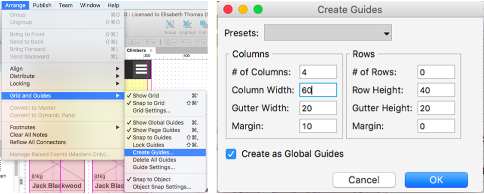
So first you probably want to set up a grid, we are doing mobile first, so start on a width of 320px and then divide this into as many columns as you wish to create your grid, with a margin between each. In this example I am using 4 columns.
To create a column drag from the ruler and then press the ‘cmd’ button if on Mac OS X and the shift button (I think) if on Windows to make sure that the grid will exist globally on all pages even when you make a new one. You know it has worked if the lines are purple.

You can also add a grid using the ‘create guides’ tool, enter in the figures you can see below for the column section, remember to check ‘create as global guides’
You need to set up a page for each object, if there is going to be lots of instances of that type of page, create a list page for the object too. I have done this for climbers and climbing places.

This list page is then a parent page of the object. I.e. the user will have to click on the list page first when navigating to the object page.
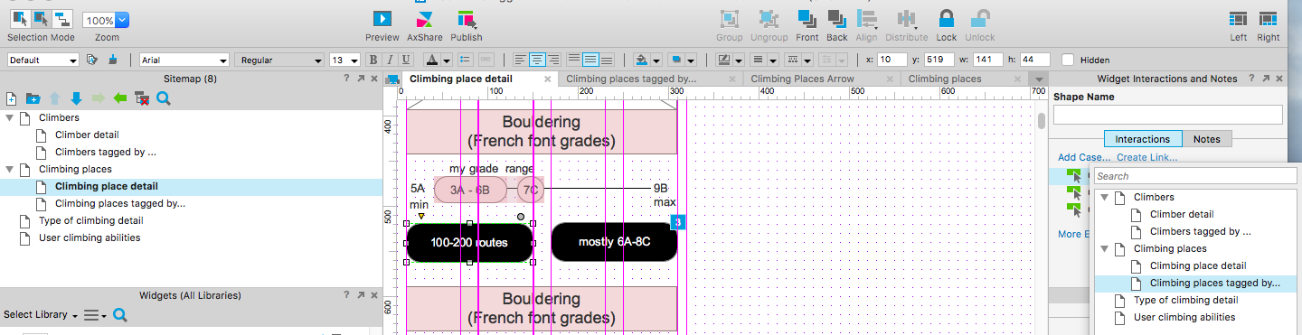
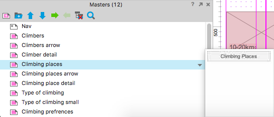
Now it’s time to test those page layout sketches, each time you add a nested object on a page layout you must create or use a master. Masters are incredibly easy to make if you follow these steps:
1. Simply drag the objects page name you wish to link to from the site map on to left the object page you are working on in the middle. Here we are on a climber detail page and I want to link to climbers saved climbing places.
2.Resize the object to fit the design
3. Right click on the object
4. Select ‘convert to master’

5. Rename master to the name of the object, in this case it is called climbing place detail, click confirm.
6. This object master then sits in the Masters section ready for you to edit or use again. It will automatically link back to the climbing place page because you initially dragged the link from this page in step 1.

On the list pages you simply need to add lots of instances of the list’s object. All you have to do is drag the object’s master from the Masters list into the list page. You can see four instances of the master on the screen in the image below, the user will have to scroll to see more. I have already gone in and edited the main climbing place detail master, it contains an abbreviated and selective version of the climbing place detail object’s content, such as an image of the place and the place’s name.
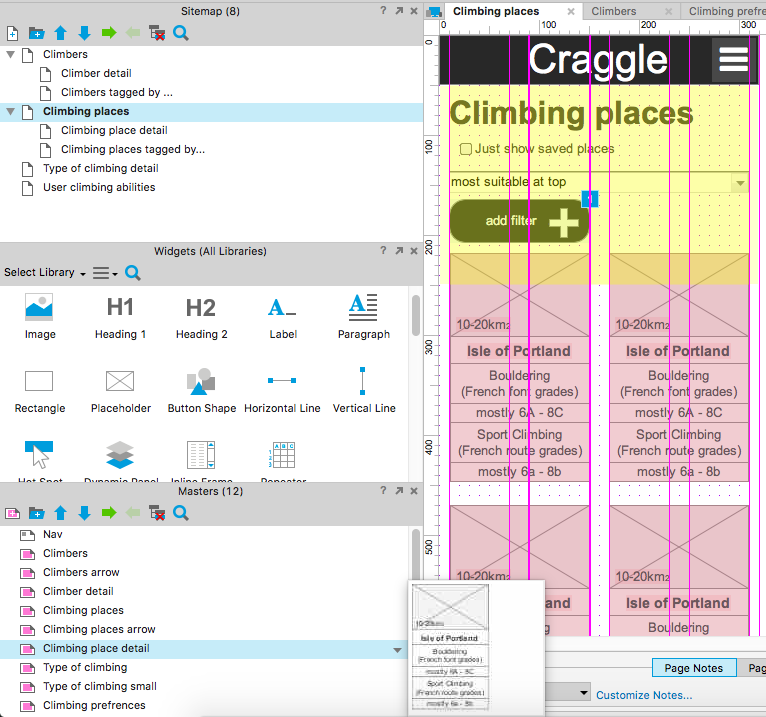
Above the nested objects on the list page I have added a title, a checkbox (which allows the user to filter to just see their saved places) and a drop down sort which will order the content by different preferences. There is also an option for the user to add a custom filter.
The user can also create a filter for this list page navigating from a climbing place detail page. All they have to do is click on a tag that they are interested in. If the user clicks on ‘100-200 routes’ for example they will be taken to the climbing places list page sorted by climbing places that have at least 100-200 routes. You create a link like this (for the purposes of this prototype) by adding a page link from every tag back to the list page where that tag has made a filter. To save time in my initial prototype I only have one example of a tag as a filter, however every tag links back to this to show the action. I also link to this page from ‘add filter’.
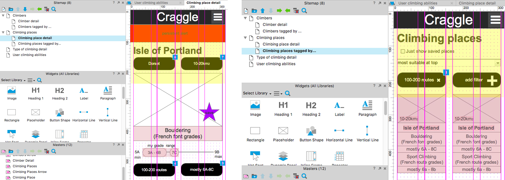
You can have different types of masters for the same object i.e. links back to the same objects page, make sure you save each one as you may want to re-use them. For climbing places (which is a list page) I have two: one which is an oblong and one which is an arrow – you can see these below.
![]()
To finish off the prototype I added a simple navbar with the name of the app and a hamburger icon at the top for the persistent nav. This gives the user access to each object list page. By clicking on the hamburger you can show and hide a list of the masters.
To see all of this in motion please have a go clicking about on my initial prototype for Craggle. You will be able to navigate between objects (in I hope an intuitive way) as well being able to add and remove a filter on the list pages. It took me about five hours to complete, which is too long really. I’m new to using masters on Axure so I am sure that with some practice I can get it down the the two hours Sophia mentioned that she would spend on a similar fidelity and size of prototype.
I hope that by reading this post and having a look at Craggle I have demonstrated the power of using OOUX to get to a place ready for review and testing earlier on in a digital products life cycle. I will be interested to see how this process fits in to a bigger project at Outlandish and the outcomes that surface from using it.