

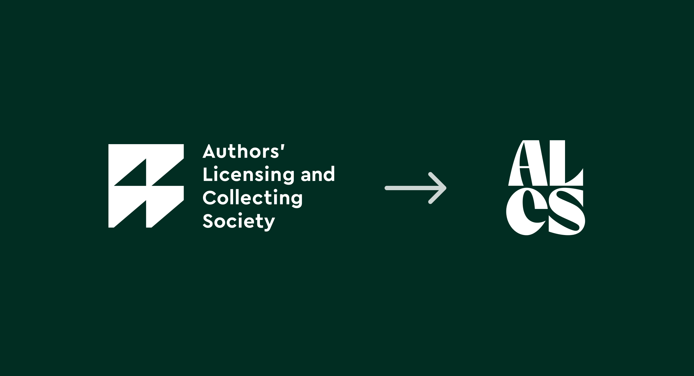
Our client, ALCS (the Author’s Licensing and Collecting Society), recently undertook a rebrand and introduced a bold new visual identity. We worked with them to implement the beautiful new brand on their site. The new brand features jewel tones like ruby reds and emerald greens, paired with flowing calligraphic shapes and a wealth of bold iconography.
ALCS wanted their website to reflect their new brand as quickly as possible, in time for a new-year launch. In this case, the goal wasn’t to redesign the website from the ground up, but to apply the new brand to the existing site at speed.
The structure, user journeys, and page templates were already established, and the timeline left no opportunity for a full UX review. The challenge was to translate the new visual identity into the existing interface in a way that allowed the brand to shine while remaining coherent, usable, and launch-ready.
Working within these constraints raised some interesting design considerations. In this post, I’ll share the approach taken, the lessons learned, and a few things worth keeping in mind when applying a new brand to an existing website at pace.
Start by identifying existing patterns
Most websites already have a set of recurring UI patterns, even if they haven’t been formally documented. Buttons, cards, page headers and content blocks often follow consistent layouts and behaviours across multiple pages.
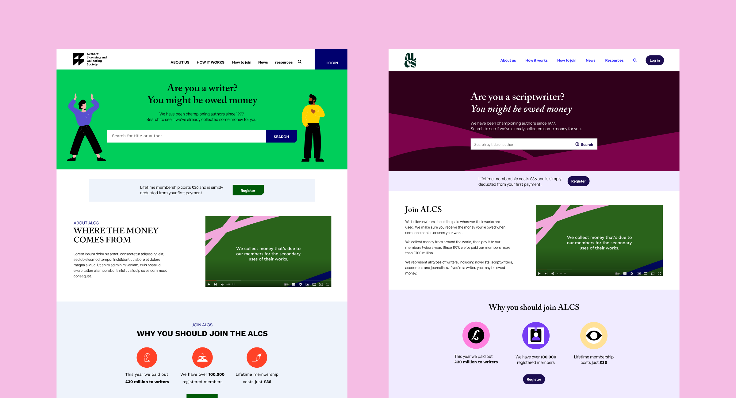
Taking time to map these patterns early helps you understand the site’s building blocks before introducing brand changes. Instead of redesigning components from scratch, the goal is to adapt these existing structures to support the new identity. For ALCS that meant keeping the underlying component structure intact while updating visual details such as colour, typography and corner radius. Working this way helped maintain consistency across the site and made implementation smoother for the development team.
Define the scope early
Clarify what will and won’t change as part of the refresh. Understanding that the project is a brand application rather than a full website redesign helps prevent scope creep.
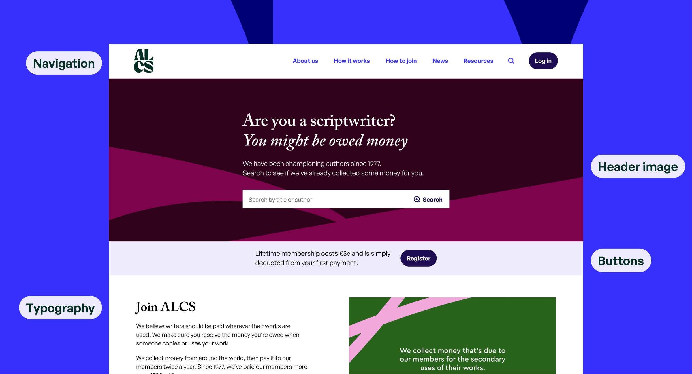
Focus on pulling together the biggest visual wins to start
When time is limited, prioritisation becomes essential. Rather than trying to update everything at once, it helps to focus on the elements that carry the most visual weight.
Elements such as navigation, typography, buttons, and colours appear throughout the site. Updating these first creates immediate visual impact and sets the tone for any visual elements to follow.
Watch out for edge cases
One of the challenges of applying a new brand is how easily visual changes can break smaller interface elements
Forms, tables, and long-form content pages often require extra attention as they tend to expose the limits of quick visual updates.
Spending time reviewing different edge cases helps ensure the rebrand feels consistent across the entire site and not just the most visible pages.
Test typography thoroughly
New fonts can affect everything from mobile layouts to long-form content. For example, new typography can introduce problems like out of proportion heading and body size hierarchy. Typography styles are not always used as intended when a site has multiple editors inputting content in a CMS (we’re human after all). This might have looked ok with the previous font styles but can end up looking a little bit jumbled when new styles are introduced.
Look ahead to the future
Even when working quickly, it’s worth considering how design decisions might affect future improvements. What happens when a new page or content block is added? What happens if the content were to double in length? Designing with these thoughts in mind will help set up your website refresh for success.
Final thoughts
As designers, we love to sweat the small stuff, but sometimes progress is better than perfection (does perfection even exist?) A well-considered website reskin can provide impact and put the money spent on a new brand to work right away.