“Like, seriously cool” – Yes that’s the feedback we got when we launched the re-designed Audience Finder dashboard. And although I’m not one for putting the word ‘like’ in front of everything, it’s fair to say that we like it very much too.
Audience Finder is a data analysis dashboard which helps arts organisations—from dance studios to theatres, and gig venues to concert halls—to understand their audiences better. Outlandish have been working on the Audience Finder tool since June 2013 and earlier this month we launched the fully re-designed flashy online tool.
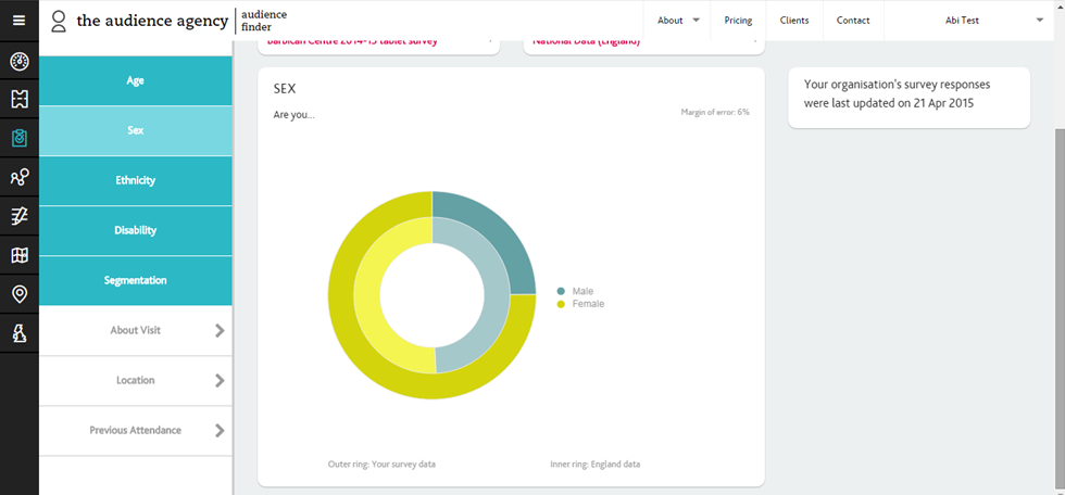
It crunches ticket data from across the UK and visualises the information in dynamic graphs, maps and tables, allowing arts organisations to compare their audiences with other organisations nationally and in their local areas. Here’s an example of one of the many graphs, which breaks down an arts organisation’s audience by gender and compares it to a national average.
The tool has had a few incarnations as the data, the expectations and the understanding of what our audiences wanted developed. One of the early versions we launched, looked like this:
It was quite content heavy and although there was lots of audience data available it took a while to work out what could be done with it. The development steps that the Audience Agency encourages arts organisations to abide by (Collect, Understand & Apply) were core to the structure of the site. This was a conscious attempt to try and instil this in to the audience finder users. After some user testing it was clear that users of the site didn’t understand how the three steps categorised the content and found it difficult to get to what is at the tool’s heart – its data.
Data is one of the things we love at Outlandish, and we were only too happy to explore the possibilities of what could be done with their vast and exciting database of arts organisations, ticket sales, and survey data and make that accessible, informative and usable to the Audience Finder user base.
Over the last 2 months and together with UXB (our design partner on the site) we rebuilt the site, making it available across platforms and across different devices. We stripped back the layers of content, and put data at the centre of the user experience. We made the interface more dashboard-like, and more intuitive, making the data take centre stage and the insights speak for themselves.
Now the Audience Finder landing page is an interactive dashboard (see pic below). And the tool allows arts venues to drill down into box office data, web analytics, and the demographic profile of visitors and benchmark these against national, regional and sector figures.
Alongside the box office data, The Audience Agency has also developed their own segmentation system: The Audience Spectrum. The different audience profiles include:
- Metroculturals – Prosperous, liberal urbanite group
- Home and Heritage – A mature group that is generally conservative in their tastes
- Experience seekers – Highly active, diverse, social and ambitious younger people engaging with the arts on a regular basis
Find out more about the segmentation system they have developed here.
Getting breakdowns of their audiences by segments, it is possible for an arts venue to understand a bit more about what type of people come to their shows, and how that compares to other areas.
And that’s not to mention how accessible the tool makes national data on arts audiences. Audience Finder crunches geographic and demographic ONS data to show the average age or gender breakdown benchmarked against an organisation’s own data. We have also developed a tool to show the density of the different segment by postal sector, allowing arts organisations to strategically plan their comms strategy to target the audiences around them.
Here’s what the data looks like for the East Midlands:
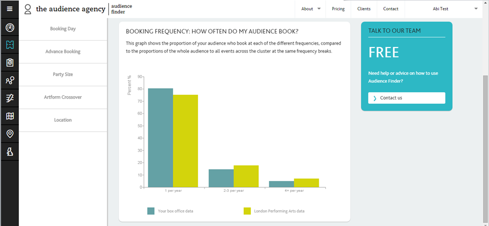
Other functionality includes graphs showing how frequently people book tickets at the same arts organisation, compared to area averages:
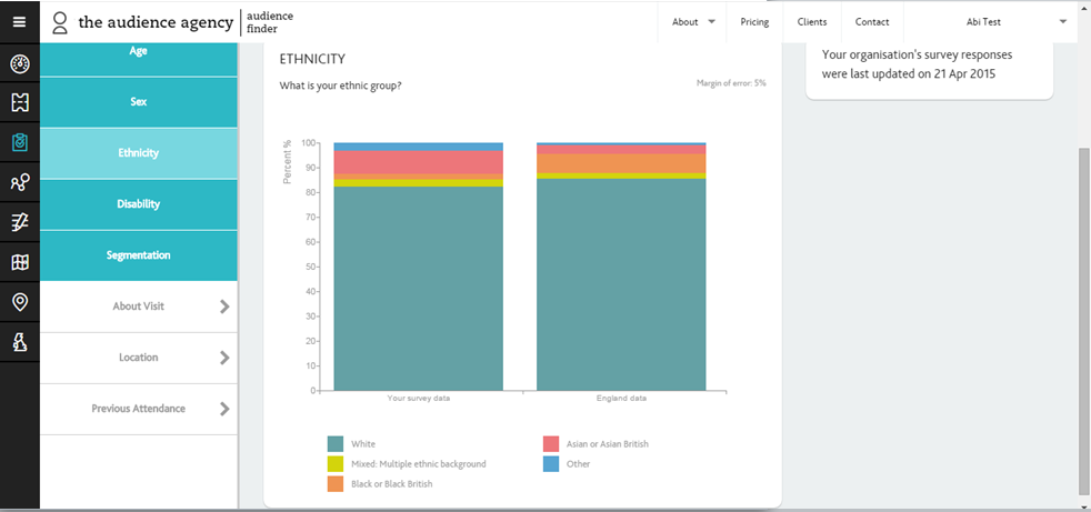
And what the ethnicity is of the people coming to see shows:
“Like, seriously cool” – Ok, so I may be biased, but I agree.


