

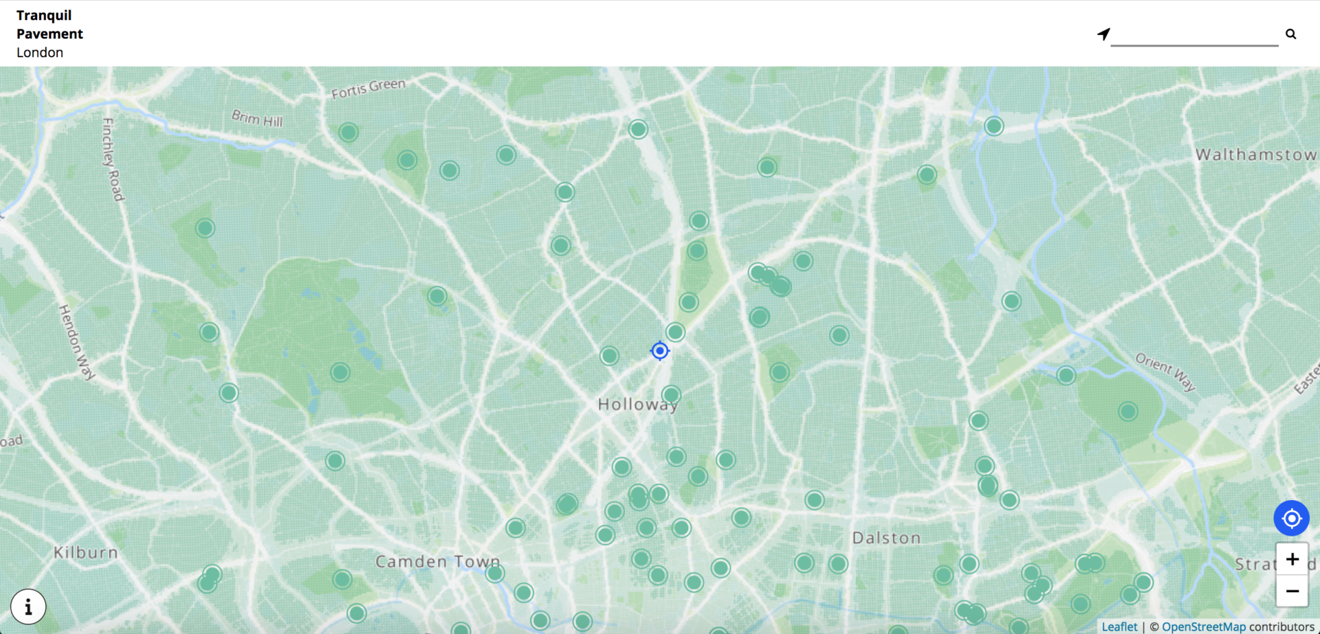
Outlandish has just launched a project with Tranquil City called Tranquil Pavement London, a web app to help people find tranquility in London.
The app is centered around a map of air and noise pollution in London, and also uses map markers to display tranquil places that have been crowd-sourced from Instagram.
The size of the data set – 5.85 million points – meant that the process of creating this map was fairly complex. This blog will explain that process, with particular focus on the visualisation of the data.
Working with a large dataset: Air and noise pollution
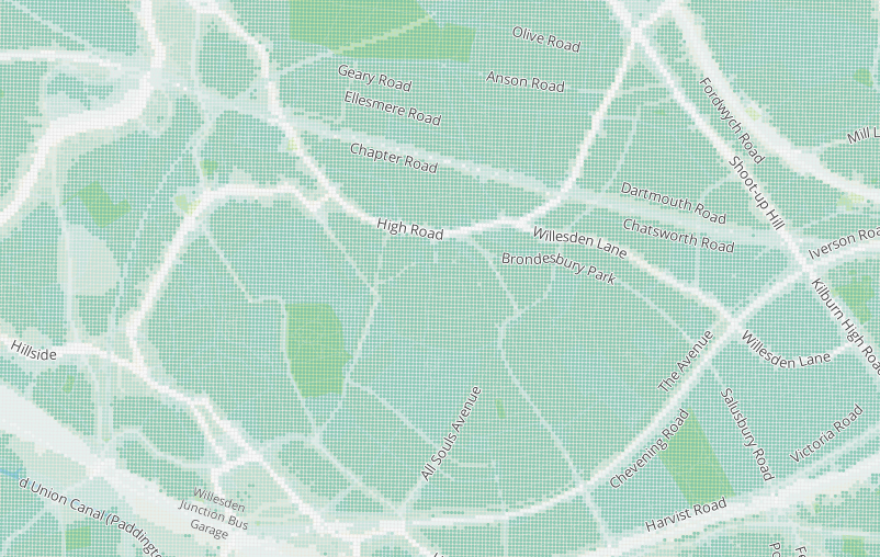
The map draws from three sources of data: Open Street Map vector tiles for the base map, Defra Noise Mapping England for the noise pollution data and the London Atmospheric Emissions Inventory for the air pollution data.
The datasets were loaded into the open source mapping software QGIS and combined to produce a noise and air pollution estimate for each OS grid square in London. This data was then exported as a CSV file available for download here.
The dataset is large, comprising 5.85 million points. Once it had been acquired, the challenge became: how can we effectively and efficiently display this data, to achieve the goals of the Tranquil Pavement project?
Visualising data & heatmap limitations
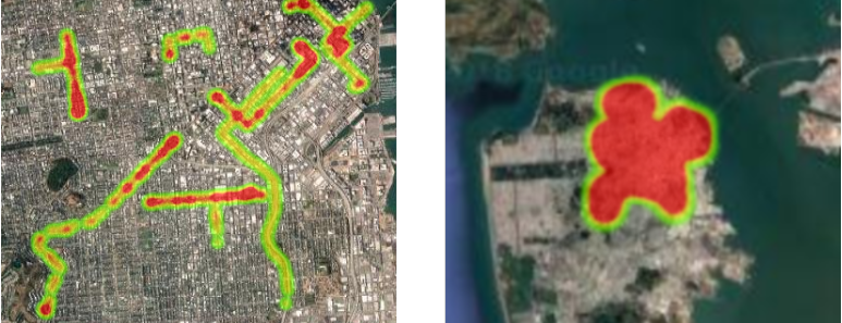
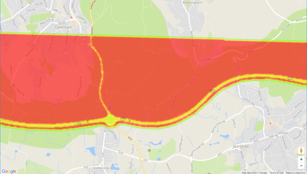
Initially, we assumed that a heatmap would be the best way to display this data. An example heatmap can be seen here. Heatmaps can be created easily in several popular mapping platforms, including Google Maps, Mapbox and Google Fusion Tables.
There were a number of issues with this approach, but primarily the choice of visualisation was wrong. Heatmaps are most appropriate when information is represented by the density of data points. A good example of this would be a map of forest fires. Certain areas would have a higher density of recorded fires, which would be represented as more data points on the map. This would cause these areas to be displayed using a more intense colour.
Although it is possible for to map our pollution data with a heatmap, a feature of heatmaps causes our data to be displayed unreliably. Heatmaps merge data points when the map becomes more “zoomed out”. This means that areas that should appear to have a low intensity will still be shown as high intensity at low zoom levels. This effect is demonstrated in both the Google Maps and Mapbox heatmap examples. The below images show the same region and data mapped using Google Maps, but displayed at different zoom levels. Note how the whole region is covered in red in the “zoomed-out” image.
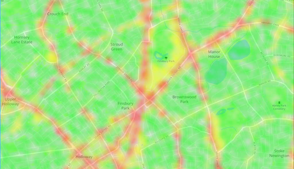
The data we have has a uniform density: there is one data point for each OS grid square in London. The correct visualisation is to simply paint each grid square with a colour derived from the pollution data point for that square. An example of this being done with air pollution can be found here.
Choosing the right mapping platform
Once we had figured out the right visualisation, we tried to implement it using both Google Maps and Mapbox. Google Maps was a non-starter, as it simply ignored all data after the first 20,000 points.
Mapbox seemed to work a little better. It couldn’t deal with the size of the data, but it automatically sampled the data to get a fairly even coverage. With a bit of tweaking of the point radius and blur radius, we could get the sampled data to cover the whole of London.
However, the map is blurry to look at, and the sampling meant that the colours are neither accurate nor precise.
QGIS – an open-source geographic information system
The third and best technology we investigated was QGIS. QGIS is a free and open-source Geographic Information System, designed for producing maps from diverse data sources.
QGIS was able to load and render the full 5.8 million point dataset, and through the use of data layer styles we were able to create an accurate visualisation of the data.
Top Tips for mapping data in QGIS:
- Use OpenStreetMap data for the base map. It is the fastest to render of all the base maps available, and allows for extensive custom styling.
- Download an OpenStreetMap from here and import it into QGIS using the instructions here (skip the download section).
- The OSM base map can be styled using the instructions found on this blog. Check Anita’s GitHub for many style.qml files you can download and apply to your map.
- If your data is missing the River Thames (or any other large rivers), follow the instructions here to bring it back. However, instead of selecting all the lines where waterway=riverbank, use the instructions here to find the features that compose the river. Then create a new polygon from these features and give it the colour of a river.
- Reduce label duplication by following instructions found in this reddit thread – for me, disabling labelling for roads shorter than 100 metres gave a huge improvement.
- Allowing QGIS to use multiple processor cores greatly increases its performance.
- When exporting the data to map tiles, use the QMetaTiles plugin (i.e. not the QTiles plugin). Tiles generated by QTiles tend to have artefacts at their edges, which are eliminated by using QMetaTiles.
How we deployed the tool
We were able to produce the map we wanted in QGIS, but how could we deploy it to our web application? Two options were available: set up a tile server, or pre-render the map into static images.
Using a tile server
The London Air map of pollution uses a tile server. Each time a user views a different section of the map (or the same section, but at a different zoom level), a request is sent to https://webgis.erg.kcl.ac.uk for the required tiles to display this section of the map. The response from this tile server is a static image that is then displayed to the user.
This was not an option for us. Due to the large amounts of data we were dealing with, our tile server would have to be very powerful (and expensive) to provide a smooth and responsive experience for our users.
Pre-rendering the map
Therefore we decided to use option two: pre-rendering the map into static images. The idea here is to represent each zoom level as a set of map tiles, where each map tile is simply a static PNG image. When a user views a section of the map, the user’s position and zoom level are used to select the map tiles that compose that section of map. These tiles are served as static files, so minimal processing power is required when sending them to the user. This means we can provide good performance with a small, low cost server, leading to a better user experience.
We output these tiles using the QGIS QMetaTiles plugin. The QMetaTiles plugin is superior to the QTiles plugin, as improves the quality of the produces tiles by using metatiling. You can read more about metatiling here, but essentially it produces larger tiles than are required and then crops them to the correct size. This results in the artefacts that appear at the edges of tiles being eliminated. Beware: a large amount of disk space is required to do this: the tiles for Tranquil Pavement use about 200GB altogether, but when using metatiles the generation required about 800GB of disk space.
The front-end library we used to display our map is Leaflet.js. It’s a very straightforward library – we simply provide it with the URL template of our static map tiles, and it takes care of the rest!. For the Tranquil Pavement project, the URL template is https://s3-eu-west-1.amazonaws.com/tranquil-pavement-tiles/default/{z}/{x}/{y}.png.
Conclusion: My top five takeaways from the project:
- Heatmaps don’t work how most people seem to expect, so make sure to check that they are the right visualisation for your data.
- MapBox is far superior to Google Maps, and appropriate whenever your dataset is smaller than around 20,000 points.
- QGIS is a fantastic piece of software. It takes a while to learn how to use, but ultimately can do more than MapBox. Furthermore, it’s free!
- OpenStreetMap data produces the most practical base map.
- Producing map tiles takes a long time and a lot of disk space – make sure you’re prepared for this. Always use QMetaTiles; never use QTiles.
I’m very much looking forward to using QGIS again, and I hope after reading this blog you’ll also give it a try!

